

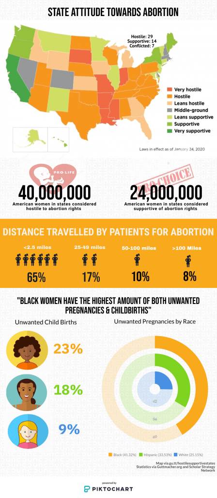
For DIY #2, I chose to highlight the state-specific policies on abortion, and how the disparities in accessible abortion services across states disproportionately impacts black women. While the state’s restriction on reproductive rights harms women all across the social order, Black women often bear the worst of it as they often lack the resources that enable White/Asian women to travel across state lines to receive abortions in supportive environments.
Currently, nearly 40 million U.S. women of reproductive age (58% of the total number) live in states that have demonstrated hostility to abortion rights. In contrast, 24 million women of reproductive age (36% of the total) live in states that have demonstrated support for abortion rights.
Guttmacher Institute
I chose to start my infographic with a map visualized by the Guttmacher institute that used a distinct color scheme that helps the audience visualise the ground-level situation of reproductive rights with ample state-specific nuances. Even though it’s a humanistic issue at the core, there are two conflicting dominant political ideologies and I chose to use the symbols of the prochoice and the prolife movements while providing the raw statistics about the difference between women living pro and anti-abortion states. I plastered the bold text over the symbols and declined their opacity to reiterate the need to put the countless human lives before political agendas.
According to the Centers for Disease Control, from 2006 to 2010, 9% of births to non-Hispanic white women were defined as unwanted, compared to 18% for Hispanic women and 23% for Black women.
Scholars Strategy Network
For depicting the amount of distance that patients travel to get abortions, I continued with the tangerine color scheme and used icons of women to symbolise the percentage of women in each distance bracket. Furthermore, I mentioned the exact percentage under the icons for the sake of clearance. To visualise the different races while talking about the unwanted birth rates, I put general sketches of each race and put the percentage next to it. For conveying the date about unwanted pregnancies and juxtapose the racial differences, I relied on an old-school swatch graph and maintained the same color palette that I used for the ‘unwanted births’ statistics.
Featured Image Via Guttmacher Institute
